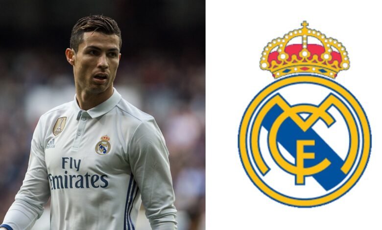
Very few badges in the history of football evoke as much passion or possess as much history as that of Real Madrid’s royal crown logo with a mulberry stripe in the middle. The first logo of the Madrid football club bears no resemblance to the current one. The logo has gone many modifications over the years and the major change came in 1909. The letter “M” in the initial logo was stylized to fit in the letters “C” and “F”.
A crown was added on top of the logo after King Alfonso XIII provided royal patronage for the club and changed the title of the club from Madrid football club to “Real” (Spanish for “Royal”) Madrid. In 1931, after Spain attained Republic status, all the symbols of the monarchy were abolished. A dark mulberry band of the Castile region replaced the crown in Real Madrid’s logo. From 1931-1939, the club was once again called as Madrid football club. Hence, the identity of Real Madrid changed again.
However, in 1941, two years after the end of the bloody civil war, both the mulberry stripe and the crown was included in the logo. Thus, the prestigious badge acquired it’s present design. Since then, the logo has undergone some minor changes. In 1997, The design of the crown was altered to give it a more modern look. Also, the violet stripe was replaced with a dark blue band.
Real Madrid’s coat of arms underwent it’s last change in 2001, when a sea blue stripe replaced the more darker version. All the colours in the logo have a symbolic meaning. The colour yellow commonly resembles gold and in Real Madrid’s case, it shows the connection with the royal family of Spain. Blue symbolizes stability and loyalty while Red stands for unlimited energy and the desire to win.
Whatever the form the symbol might take in the future, the club’s identity as one of the biggest brands in football will not change.